
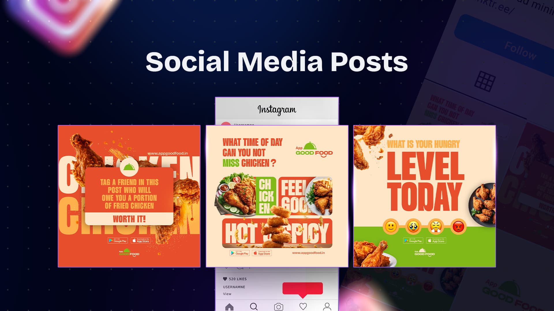
Mouth-Watering Social Media Post
In the world of social media, especially for food-related businesses, grabbing the audience's attention is crucial. With a plethora of options just a swipe away, creating compelling visuals that stand out is key. Recently, I had the opportunity to design a social media post for App Good Food, a food delivery app that promises delicious meals right at your doorstep. This post was crafted to make viewers crave the comfort of crispy, hot, and spicy chicken at any time of day. Let me take you through the thought process behind this design!
Design Objectives and Strategy
When working on a social media campaign for a food delivery app, the primary objective is to appeal directly to the viewers' senses—sight and imagination—so they can almost taste the food. The goal for this post was clear: evoke a craving and a sense of "I need to have it now!" for the featured food, which in this case, was a delicious serving of crispy chicken.
To achieve this, I focused on three main elements:
-
Bold Typography: The text needed to be loud, bold, and eye-catching. I opted for large, chunky fonts in vibrant colors like red, green, and orange to contrast well with the creamy background. The question "WHAT TIME OF DAY CAN YOU NOT MISS CHICKEN?" serves to engage the viewer immediately, inviting them to think about their favorite time to enjoy chicken.
-
Appealing Imagery: Imagery plays a crucial role in food-related designs. High-quality images of crispy, hot, and spicy chicken with sides like fries and fresh vegetables were used to enhance the visual appeal. The intention was to make the viewers’ mouths water and have them imagining that first bite of deliciousness. The composition of the images was designed to create layers and dimension, making the food the hero of the post.
-
Color Harmony and Contrast: The color palette for this post was carefully chosen to align with the brand’s identity while ensuring that it complemented the food visuals. Warm tones like red and orange evoke feelings of hunger and excitement, which are ideal for promoting food. Green was added to provide a fresh and balanced look, ensuring the post feels appetizing yet vibrant.
Design Elements and Their Impact
-
Grid Layout: The post utilizes a grid-based design to separate different sections, making it easier for the viewer to focus on each element. This layout helps guide the eyes naturally from the catchy headline to the delicious food images.
-
Typography Balance: The combination of different font sizes and weights not only creates a visual hierarchy but also adds to the dynamic nature of the post. Words like "FEEL GOOD" and "HOT & SPICY" are intentionally made prominent to create emphasis.
-
Branding and CTA: The app’s logo, website link, and download options for Google Play and the App Store are strategically placed to ensure that after the craving is triggered, the next steps are easy and accessible. Clear calls-to-action (CTAs) are crucial in driving conversions, especially in social media marketing.
Final Thoughts
Designing for food brands is always a fun challenge because it allows you to play with colors, textures, and emotions. This project for App Good Food was particularly rewarding because it combined creativity with strategy to deliver a design that not only looks good but also serves a clear marketing purpose.
If you’re in need of engaging and impactful designs for your brand, feel free to connect! I love working with clients to bring their visions to life through creative and effective design solutions.
Tools used:
 Figma
Figma Illustrator
 Photoshop